We've been making interactive web applications for since at least 1995, when Netscape shipped JavaScript (née LiveScript). Yet I still see the same basic usability mistakes on many websites.
I've started a list of the ones I think we should all agree on—a set of UI Rules, if you will. First on the list is one of the easiest to fix.
Rule #1. Focus on the first text field.
Most important for login and signup pages, but this rule applies to almost any form on any page (with the possible exception of pages with lots of separate forms). Why not save your users a click when they're performing the primary action on a page?
Let's look at some examples. I don't mean to pick on any of these companies—my methodology here was picking randomly off the list of trending startups on AngelList.

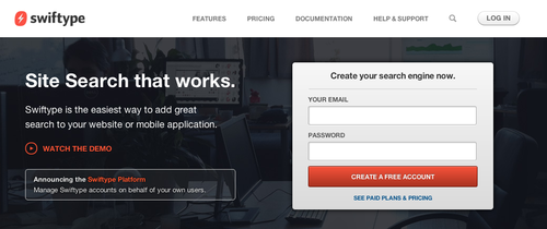
Swiftype fails in the basic case—there's a signup form on the front page, but the text isn't focused. The same is true of their login page.

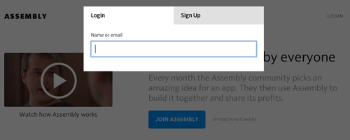
Assembly does a better job—when you click "Login" on their page, the email address box has focus. They fail in a more subtle way, however—when I click "Signup," it takes another click to set focus on the Username field. (Perhaps they expect me to click on the Facebook signup option).
This is a common pitfall—when developers get deep into modal Javascript UI, details like input can get overlooked. Just to illustrate the complexity: if you visit their signup page directly, focus is set—and focus is kept when switching to the Login tab—but it's lost again when switching to the Signup tab.
The Fix
Developers often use JavaScript to solve this problem, but there's an even easier solution—the autofocus attribute on input fields. It's supported in all modern desktop browsers, but not on mobile (potentially for usability reasons according to this explanation from Wufoo).
Let's all agree to follow this rule from now on—however you do it, focus on the first text field on the page. In almost every case, you're saving your users time, which will lead to increased engagement and conversion rates. Together, we can make the Web a less frustrating place.