Posts for Tag: product design

UI Rule #2: Make it easy to unsubscribe

Here's another easy win—never make users log in to unsubscribe from email notifications. For nearly every website, there's no security risk in allowing users to unsubscribe without logging in, and there are many benefits, including goodwill from users and fewer spam reports. Unfortunately, most popular sites don't take the simplest approach to solving this problem.

Bad approach: Twitter & Facebook

Twitter sends a lot of different kinds of notifications, and their approach to notification management is complex—as evidenced by their incredibly complex footer text, which wouldn't fit into 2 tweets, let alone one.

image

When you get a specific kind of notification (e.g. "@dzohrob is now following you on Twitter!"), you can disable *only* that notification type with one click. However, any other action requires you to log in, which means trying to remember your password and potentially going through a reset password process.

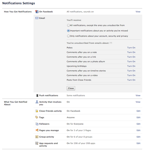
Let's say you remember your password—now you're presented with a list of 21 different notification types, some of which have sub-options. And of course, there's no way to unsubscribe from all of them. What an awful user experience.

image

Facebook takes a similar approach, allowing you to opt-out of one notification type, but requiring a login for any other management. Their notification management page is slightly better than Twitter's, but there's still no way to unsubscribe from all notifications with one click.

image

Good approach: Yelp

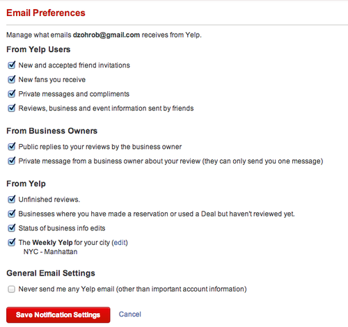
Yelp does it right. Even though they send many different types of notifications, like Facebook and Twitter, their unsubscribe link lets me manage the email I receive from them, and even lets me unsubscribe from all emails with one click. Nice work.

image

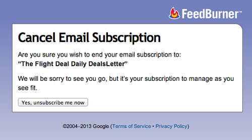
Bad approach: Feedburner

I'm not sure what kind of problem the "unsubscribe confirmation" page actually solves. Accidental clicks on unsubscribe links? Forwarded emails? Either way, it makes users do extra work for little benefit. I hope this pattern disappears over time.

image

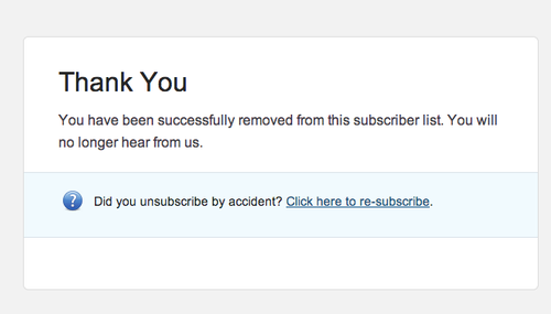
Good approach: Campaign Monitor & MailChimp

Thankfully, companies like MailChimp that specialize in email delivery offer much better subscription management links. For example, I just got an email from SXSW—clicking through results in an instant unsubscribe, with the option to resubscribe.

image

Doing it the right way is easy

It's easy to choose a UI pattern for your unsubscribe links.

If your service sends many different types of email, follow Yelp's lead -- let users click through and manage all notification types without logging in. If you're sending a newsletter, let them unsubscribe with one click.

Make the right choice. You'll make your users happier and reduce your spam reports.

UI Rule #1: Focus on the first textfield

We've been making interactive web applications for since at least 1995, when Netscape shipped JavaScript (née LiveScript). Yet I still see the same basic usability mistakes on many websites.

I've started a list of the ones I think we should all agree on—a set of UI Rules, if you will. First on the list is one of the easiest to fix.

Rule #1. Focus on the first text field.

Most important for login and signup pages, but this rule applies to almost any form on any page (with the possible exception of pages with lots of separate forms). Why not save your users a click when they're performing the primary action on a page?

Let's look at some examples. I don't mean to pick on any of these companies—my methodology here was picking randomly off the list of trending startups on AngelList.

image

Swiftype fails in the basic case—there's a signup form on the front page, but the text isn't focused. The same is true of their login page.

image

Assembly does a better job—when you click "Login" on their page, the email address box has focus. They fail in a more subtle way, however—when I click "Signup," it takes another click to set focus on the Username field. (Perhaps they expect me to click on the Facebook signup option).

This is a common pitfall—when developers get deep into modal Javascript UI, details like input can get overlooked. Just to illustrate the complexity: if you visit their signup page directly, focus is set—and focus is kept when switching to the Login tab—but it's lost again when switching to the Signup tab.

The Fix

Developers often use JavaScript to solve this problem, but there's an even easier solution—the autofocus attribute on input fields. It's supported in all modern desktop browsers, but not on mobile (potentially for usability reasons according to this explanation from Wufoo).

Let's all agree to follow this rule from now on—however you do it, focus on the first text field on the page. In almost every case, you're saving your users time, which will lead to increased engagement and conversion rates. Together, we can make the Web a less frustrating place.

Unboxing the Kindle tells us a lot about Amazon

I left my old Kindle Keyboard 3G at a friend's house in San Francisco a few weeks ago, and used the opportunity to upgrade to the new Kindle Paperwhite. Amazon was kind (or crazy) enough to offer $3.99 next-day shipping on a Sunday night at 10pm—a deal I couldn't resist.

Unboxing a brand-new Kindle illuminates quite a bit of Amazon's product philosophy.

Kindle Paperwhite 2013

No retail packaging

The Kindle ships in a plain blue cardboard box, with little decoration. The only hint on the outside is a subtly embossed Kindle logo. Inside the box are the Kindle itself, a USB cable, and a quickstart guide. Minimal packagaing at its minimal-est.

This all makes sense because the Kindle isn't meant to be sold on store shelves. Amazon is the primary retailer, and consumers know what they're getting—therefore the box doesn't need to sell the product. Contrast this with Apple's box for Macbook Pros—even though they've toned it down in recent years, there's still the air of luxury about the packaging.

Kindle paperwhite built in tutorial

First-use experience

After turning on the Kindle (the battery has 50% charge—a nice touch), I can see where Amazon invested their time.

The tutorial is fantastic. It feels like Amazon took their cues from social games, where the on-boarding experience walks you through the major features step-by-step. Here, we learn how to turn pages, use the toolbar to change text size and backlight levels, and a few other common tasks.

And at the final step, there's even an upsell to Amazon Prime. Kudos to whomever put that step in there.

The end of physical books?

The new Kindle feels impressively responsive, and it's a great upgrade for owners of older Kindles. 

Of course, I have a few quibbles. It's not always clear whether I've successfully turned the page backwards, because the tap target for going back feels too small and there's no visual indication (other than the "location number" in the lower-left corner) of whether I've gone forward or backward. Also, having dedicated page-turning buttons on the Kindle Keyboard made it easier to read with one hand. Still, I'm confident in Amazon's lock on dedicated reading devices. 

As a lover of physical books, I know I'll still buy hardcovers and paperbacks -- they're one of the only physical items I still collect. But with a product this good, I can see why e-books are going to take over, and physical books will become the LPs of reading.