Audiobooks and the Return of Storytelling

What happens when you hear a text rather than read it? The obvious thing is that you can do something else with your eyes. That is why I can listen to books when I garden. My hands and eyes can work. And so listening to a book is a different sensory experience than reading it. The inner imagining of the story becomes commingled with the outer senses — my hands on the trowel, the scent of tansy in the breeze.

—T.M. Luhrmann, Audiobooks and the Return of Storytelling—http://www.nytimes.com/2014/02/23/opinion/sunday/luhrmann-audiobooks-and-the-return-of-storytelling.html

I've always been curious about audiobooks but my primary activities—working (i.e. coding), reading, making music—require my full attention. When I'm really working, even regular conversation can be a huge distraction. And my longest commute is a 10-minute walk, which offers little opportunity for listening.

I wish I had a hobby that required my hands but not my conscious attention. I know I'm missing out on a lot—not just audiobooks but NPR and other podcasts that I hear about from friends. Theoretically, I could sit and listen attentively to NPR or a book, but somehow I never make the time. 

Maybe I'll try listening to This American Life next time I'm cooking a big meal.

Data-driven decision-making

My first startup job (at HOTorNOT) was essentially a "startup school." Though the site seemed frivolous on the surface, the team behind it was small, dedicated and fiercely data-driven–using homegrown tools—before being data-driven became a "lean" mantra.

These days, anyone can collect data simply by dropping in tracking code from Mixpanel, Heap, or even Segment.io, a meta-analytics service. But all this data collection is pointless unless you can use it to make decisions.

Collect correctly

The first requirement for data-driven decision-making is good data. Collect it all and make sure it's correct, that you're measuring what you intend to measure. It's easy to make mistakes here—whether it's a database query that's slightly off, or missing a segment in Google Analytics.

If you and your colleagues don't have faith in your data, then you won't be able to make decisions with it.

Ask good questions

After you've got good data, you should ask good questions. The more specific your question, the better—not "how many users have signed up", but "Which channels have high-value users come from in the last 6 months?" 

This question is slightly more complex than it sounds—you have to define what "high-value" means (and different people in your company might have different opinions)—but it's certainly answerable, and will give you more actionable analysis than just asking about "all users."

Analyze and Act

Next, analyze your data to answer your question. There are plenty of tools available for this—segmentation, funnel analysis, cohort analysis, plain old number-crunching in Excel. I won't go into detail here. But you should be able to answer the question you've asked if you've collected correct data.

The last step can be the hardest—acting on your analysis. If you're like most product designers, you'll often find data that disprove strongly-held opinions about your product. You may have to convince your team that your analysis is correct.

There will always be situations when you don't have enough time to rigorously collect and analyze data, or when you're creating something entirely new--these are times to use your intuition and make predictions based on previous experiments. But if you have the time, making an effort to drive your decision-making based on data will pay off.

UI Rule #2: Make it easy to unsubscribe

Here's another easy win—never make users log in to unsubscribe from email notifications. For nearly every website, there's no security risk in allowing users to unsubscribe without logging in, and there are many benefits, including goodwill from users and fewer spam reports. Unfortunately, most popular sites don't take the simplest approach to solving this problem.

Bad approach: Twitter & Facebook

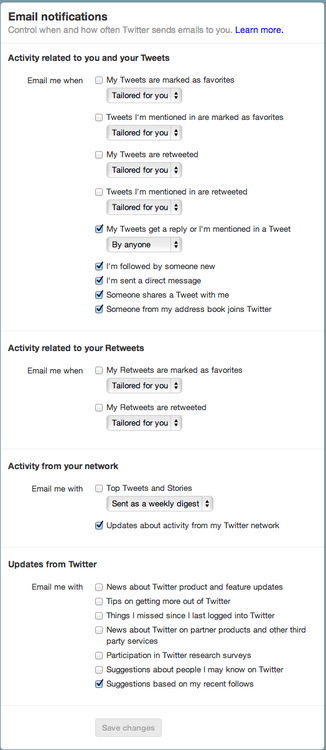
Twitter sends a lot of different kinds of notifications, and their approach to notification management is complex—as evidenced by their incredibly complex footer text, which wouldn't fit into 2 tweets, let alone one.

image

When you get a specific kind of notification (e.g. "@dzohrob is now following you on Twitter!"), you can disable *only* that notification type with one click. However, any other action requires you to log in, which means trying to remember your password and potentially going through a reset password process.

Let's say you remember your password—now you're presented with a list of 21 different notification types, some of which have sub-options. And of course, there's no way to unsubscribe from all of them. What an awful user experience.

image

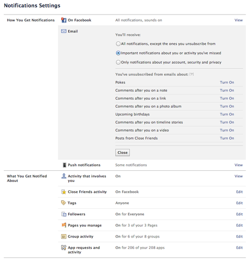
Facebook takes a similar approach, allowing you to opt-out of one notification type, but requiring a login for any other management. Their notification management page is slightly better than Twitter's, but there's still no way to unsubscribe from all notifications with one click.

image

Good approach: Yelp

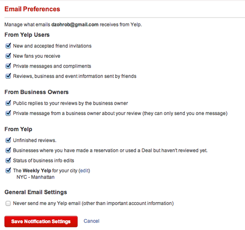
Yelp does it right. Even though they send many different types of notifications, like Facebook and Twitter, their unsubscribe link lets me manage the email I receive from them, and even lets me unsubscribe from all emails with one click. Nice work.

image

Bad approach: Feedburner

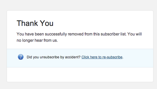
I'm not sure what kind of problem the "unsubscribe confirmation" page actually solves. Accidental clicks on unsubscribe links? Forwarded emails? Either way, it makes users do extra work for little benefit. I hope this pattern disappears over time.

image

Good approach: Campaign Monitor & MailChimp

Thankfully, companies like MailChimp that specialize in email delivery offer much better subscription management links. For example, I just got an email from SXSW—clicking through results in an instant unsubscribe, with the option to resubscribe.

image

Doing it the right way is easy

It's easy to choose a UI pattern for your unsubscribe links.

If your service sends many different types of email, follow Yelp's lead -- let users click through and manage all notification types without logging in. If you're sending a newsletter, let them unsubscribe with one click.

Make the right choice. You'll make your users happier and reduce your spam reports.

UI Rule #1: Focus on the first textfield

We've been making interactive web applications for since at least 1995, when Netscape shipped JavaScript (née LiveScript). Yet I still see the same basic usability mistakes on many websites.

I've started a list of the ones I think we should all agree on—a set of UI Rules, if you will. First on the list is one of the easiest to fix.

Rule #1. Focus on the first text field.

Most important for login and signup pages, but this rule applies to almost any form on any page (with the possible exception of pages with lots of separate forms). Why not save your users a click when they're performing the primary action on a page?

Let's look at some examples. I don't mean to pick on any of these companies—my methodology here was picking randomly off the list of trending startups on AngelList.

image

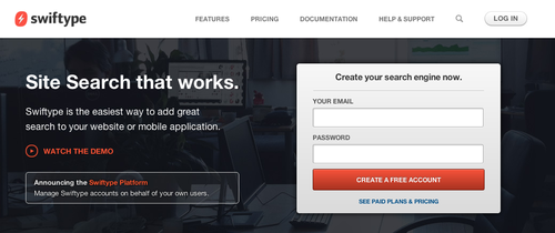
Swiftype fails in the basic case—there's a signup form on the front page, but the text isn't focused. The same is true of their login page.

image

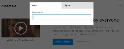
Assembly does a better job—when you click "Login" on their page, the email address box has focus. They fail in a more subtle way, however—when I click "Signup," it takes another click to set focus on the Username field. (Perhaps they expect me to click on the Facebook signup option).

This is a common pitfall—when developers get deep into modal Javascript UI, details like input can get overlooked. Just to illustrate the complexity: if you visit their signup page directly, focus is set—and focus is kept when switching to the Login tab—but it's lost again when switching to the Signup tab.

The Fix

Developers often use JavaScript to solve this problem, but there's an even easier solution—the autofocus attribute on input fields. It's supported in all modern desktop browsers, but not on mobile (potentially for usability reasons according to this explanation from Wufoo).

Let's all agree to follow this rule from now on—however you do it, focus on the first text field on the page. In almost every case, you're saving your users time, which will lead to increased engagement and conversion rates. Together, we can make the Web a less frustrating place.

Unboxing the Kindle tells us a lot about Amazon

I left my old Kindle Keyboard 3G at a friend's house in San Francisco a few weeks ago, and used the opportunity to upgrade to the new Kindle Paperwhite. Amazon was kind (or crazy) enough to offer $3.99 next-day shipping on a Sunday night at 10pm—a deal I couldn't resist.

Unboxing a brand-new Kindle illuminates quite a bit of Amazon's product philosophy.

Kindle Paperwhite 2013

No retail packaging

The Kindle ships in a plain blue cardboard box, with little decoration. The only hint on the outside is a subtly embossed Kindle logo. Inside the box are the Kindle itself, a USB cable, and a quickstart guide. Minimal packagaing at its minimal-est.

This all makes sense because the Kindle isn't meant to be sold on store shelves. Amazon is the primary retailer, and consumers know what they're getting—therefore the box doesn't need to sell the product. Contrast this with Apple's box for Macbook Pros—even though they've toned it down in recent years, there's still the air of luxury about the packaging.

Kindle paperwhite built in tutorial

First-use experience

After turning on the Kindle (the battery has 50% charge—a nice touch), I can see where Amazon invested their time.

The tutorial is fantastic. It feels like Amazon took their cues from social games, where the on-boarding experience walks you through the major features step-by-step. Here, we learn how to turn pages, use the toolbar to change text size and backlight levels, and a few other common tasks.

And at the final step, there's even an upsell to Amazon Prime. Kudos to whomever put that step in there.

The end of physical books?

The new Kindle feels impressively responsive, and it's a great upgrade for owners of older Kindles. 

Of course, I have a few quibbles. It's not always clear whether I've successfully turned the page backwards, because the tap target for going back feels too small and there's no visual indication (other than the "location number" in the lower-left corner) of whether I've gone forward or backward. Also, having dedicated page-turning buttons on the Kindle Keyboard made it easier to read with one hand. Still, I'm confident in Amazon's lock on dedicated reading devices. 

As a lover of physical books, I know I'll still buy hardcovers and paperbacks -- they're one of the only physical items I still collect. But with a product this good, I can see why e-books are going to take over, and physical books will become the LPs of reading.

Why we built Lookmark

Reposting from the Lookmark blog, with apologies to the family member whose Facebook update I single out in this post. If you want to skip ahead, just sign up for Lookmark and tell me what you think.]

When I first joined Facebook, I updated my status and added photos often. It was a place for me and my actual friends to have actual conver­sa­tion­s—a welcome change from Myspace, which had been filled with animated GIFs and lots of quote-unquote “friends.”

Five years later, I barely update my Facebook at all—­maybe once or twice a month. When this update from a family member appeared in my News Feed a few months ago, I knew my relation­ship to Facebook had changed permanently:

Reagan

Facebook has achieved their goal of building the best social graph on the Web. And that’s why I stopped updat­ing—every single update is shared to 700 current friends, former friends, random people from high school, coworkers and former cowork­ers, profes­sional contacts, immediate family, not-so-immediate-family, and randoms. Each update now forms a piece of our Timeline, to chron­icle all of our life events for posterity.

I stopped sharing because I don’t want every link I share to be perma­nently archived and viewed by any of my friends and family, or the HR depart­ment for my next job, or my future kids (if Facebook is still relevant by the time they’re old enough to use their iPhone 19).

This is exactly the problem that startups like Path are trying to solve. Path is meant to be a new, virgin terri­to­ry—a place for your real friends and family. It’s also the reason that I will never use Facebook Social Reader apps, like the Washington Post app, which automat­i­cally share all articles you read to your Timeline. I don’t want to share every article with my 700 friends, and I don’t want to perma­nently, publicly archive it on my Timeline. And I don’t want to see every article my 700 friends read, either.

Automatic sharing can be very compelling, though. When Last.fm launched (way back in 2002!) it was one of the first services to take advan­tage of automatic sharing—by simply installing the Audio­Scrob­bler plugin, you could share every­thing you played in iTunes, automatically.

While brain­storming ideas for new apps, I thought: “What about a Last.fm for news, a browser plugin that shares what you read automat­i­cal­ly?” I built a proto­type of the concept in a few days back in April to test the concept. When I showed it to my cofounders, we all agreed that it was very compelling, even with a total of 3 people using it—so we’ve spent the last few months building and refining the product. We call it Lookmark.

Lookmark is a Chrome exten­sion that automat­i­cally and privately shares what you’re reading from sites you choose (like the New York Times or links from Hacker News) with the friends you choose. Lookmark solves many of Facebook’s sharing problems because we designed from the ground up it for private sharing with a small group of close friends. It’s become an addic­tive source of news and conver­sa­tion over the past few month­s—and we’re just getting started.

We’re slowly opening Lookmark to new users. Inter­ested? Sign up at Lookmark.com and add me as a friend. I’d love to hear your feedback.

The joy of code

I’ll admit it—I love program­ming, and I have since I was a kid. This makes me a nerd, but at least I’m an honest nerd.

Code is a unique medium. There’s no activity better suited for the achievement of flow, which Wikipedia defines as “the mental state of opera­tion in which a person in an activity is fully immersed in a feeling of energized focus, full involve­ment, and success in the process of the activity.”

There’s something really special about hacking away on something and then, after hours or days of strug­gle—­making it actually work. And that joy of comple­tion, of having heroically strug­gled and then solved the problem, happens again and again. A good programmer working on a hard problem has little dopamine bursts firing in their brain all day.

I’m still not over it. And I think many people would benefit from (and enjoy!) learning how to code.

A computer on every desk, and in every home

Steve Jobs gets most of the credit for being a revolu­tionary technology leader, but Bill Gates was equally, if not more, vision­ary. In 1980, Gates defined the mission of Microsoft “A computer on every desk, and in every home.”1 It’s diffi­cult, now that we we all have incred­ibly powerful computers in our homes, cars, and pockets, to remember how insane this was at the time.

Microsoft executed that insane vision nearly flawlessly.

Computers became integral to many jobs in the 1980s and especially the 1990s, as the Internet penetrated workplaces and Microsoft’s Office software became ubiqui­tous. New software dramat­i­cally changed the nature of office work.

We’re about to experi­ence another dramatic change. The New York Times recently published The Age of Big Data. You should read it, but let me summa­rize: As computers become part of more things (phones, cars, toast­ers), they will generate more and more data, and we’ll need smart analysts to make sense of it all. Office workers will experi­ence a big shift like they did in the 90’s,as the ability to analyze data becomes more integral to every job—from manage­ment, to market­ing, to design, to front-line information workers.

I believe that simple computer profi­ciency will no longer suffice as software takes over more aspects of work and life. Not that it’ll be neces­sary for all office workers to become masterful program­mers; but those who can write simple programs to help automate their daily work and make sense of piles of data will have an advantage.

This change means more people will have the oppor­tu­nity to experi­ence the joy of code. Unfor­tu­nately, learning requires hard work, and most people haven’t been educated in the basics of computational thinking.

How will all these people learn how to code?

Learn BASIC now

When I was around eight years old I asked my parents to buy me a book called Learn BASIC Now. (Amazingly enough, Amazon still sells the book for a penny.) I remember sitting down at the computer in our living room and working through the book’s exercises in Quick­BA­SIC, a program­ming language included with most PCs at the time.

Within a few weeks I was able to make simple video games, and by the time I was in middle school I was asking my parents for related stuff—­more books, then an Internet connec­tion, then a domain name (which cost $100 at the time!) and Web hosting service, so I could help others learn.2

One of the most popular games I wrote as a kid had primi­tive graphics that looked like this:

Lander QBasic game

This wasn’t state-of-the-art for 1994, but it was playable and maybe even fun. I called the game Lander. The goal was to safely pilot your ship to a landing strip on the moon, avoiding obsta­cles along the way3. I really enjoyed making games and sharing them with friends and on the Web—it was a great motivator for me to improve as a programmer.

But what worked for me would­n’t work today. The everyday systems we use have become more compli­cated, and it’s harder to create a simple program of acceptable quality.

Most DOS users would be able to find and run GW-BASIC or Quick­BA­SIC, two program­ming languages that shipped with the operating system—but although current Macs ship with several powerful languages installed, most newcomers would­n’t know where to find them. If they could, the Terminal would seem scary because the Mac user inter­face covers up its text-based underpinnings.

Even then, creating a text-based program would­n’t seem that impres­sive—the simplest iPhone apps come with beauti­ful, animated inter­faces that react instantly to our touch, courtesy of Apple’s design tools. A text-only number guessing game seems pretty lame by comparison.

Learning to code in 2012

So how does one get started, given the complexity of today’s computers and the high expec­ta­tions of users? Thank­fully, many startups and univer­si­ties have begun tackling the problem in innovative ways.

Udemy offers a class by Zed Shaw called Learn Python the Hard Way for $29. Zed also offers a free HTML book for the course. Zed’s premise is that the best way to learn is by doing, so you’ll be doing a lot of typing. This seems to me like a Good Thing.

Another startup called Codecademy offers a unique way to learn—sim­ple, step-by-step tutorials that run in your web browser, allowing you to inter­ac­tively learn how to code without installing any software or buying any books. They’ve recently received a lot of press for a 52-week program called Code Year. When you sign up for Code Year, you receive a weekly code lesson via email which you can complete on their website. There are also Q&A forums where you can get help with each lesson. Hundreds of thousands of people have signed up, including high-profile folks like Mike Bloomberg.

There are a couple of poten­tial downsides to Code Year and Codecad­emy. Currently, they only teach Javascript, which I would­n’t recom­mend as a first language for a begin­ning program­mer. Second, the inter­ac­tivity of the lessons hides some of the reali­ties of coding. Program­ming is a unique activity because for the most part it’s a very solitary journey—y­ou’re alone with your work, shuffling logic around your brain. I’m curious if the folks who go through Codecademy tutorials are ready for the kinds of frustra­tions they’ll face—Learn Python The Hard Way is much more like “actual” programming.

There are tons of other great resources, far too many to list here. The Khan Academy has great video lectures; Google offers excellent Python tutorials; MIT offers their Intro to Computer Science and Programming, and Stanford offers an Intro to Computer Science and Programming Methodology..

Regard­less of which method you end up trying, if you want to learn, find something that appeals to you and stick with it. Don’t get discour­aged; the rewards will reveal themselves over time.

Conclusion

Learning to code is like learning to play an instru­ment. Some people will achieve basic easier than others. But for nearly every­one, becoming a good programmer will take many hours of delib­erate practice; it’s not something you can achieve in hours or days, no matter how many tutorials you read.

To be a great program­mer, you have to really want to learn; it’s not going to happen in a day or a week. Thank­fully, you probably don’t need to become a great programmer unless you plan to pursue a career in software engineer­ing. You can learn enough code in a short time to improve and automate some of your daily work.

I hope that the changes ahead as we enter the “Age of Big Data” give more people the oppor­tu­nity to experi­ence the joy of code.

I’d love to hear from people who want to learn code. If you find a particular resource linked in this post helpful (or terrible), or you think I’ve missed something, please let me know.

Notes

1 The full quote is actually “A computer on every desk and in every home, all running Microsoft software.” Steve Jobs deserves praise for rescuing Apple in the early 2000s and taking leader­ship of the technology indus­try, but it was Microsoft who really brought personal computers to the masses.

2 Sure enough, some of my tutorials are still floating around the Web. This taught me an early lesson in how anything you put on the Internet never goes away.

3 The game borrowed from similar “land the ship” games at the time. A bit more expla­na­tion on its mechan­ics: the turquoise strip at the bottom of the screen repre­sents a lunar landscape; the red flaming comet is an obstacle to avoid; and the shaded golf ball-like things are supposed to be planets to dodge. (Don’t ask me why planets are hovering above the moon’s surface; it made sense at the time). The code for this game still floats around the internet—it’s embarrassing.


Starting up again

It’s been almost five years since I started my last startup.

I remember clearly the heady blend of optimism and anxiety that came with filing our incor­po­ra­tion papers, followed by the pride and sweat and joy of brain­storm­ing, building and launching our first real product.

I just started a new startup with two great friends, Amit and Drew, and those feelings are back. The five inter­vening years have brought successes, failures, and hard-learned lessons, yet I could­n’t feel more sanguine about the future.

I should probably be more worried about the months ahead­—there’s nothing to anchor me and my cofounders except our own deter­mi­na­tion and wits. It’s a long, hard road, and startups fail for a lot of reasons.

Yet despite all that, I still feel optimistic.

I’ll do my best to correct my mistakes from my last go-round1. Yet even if I fail this time, I feel like I’ve already won. Inertia is one of the strongest forces in the world—there are so many different things acting to prevent one from doing something, from making something. And somehow, we’ve managed to give ourselves the oppor­tu­nity to really create something awesome.

All we have to do now is make the most of it.

1 See my previous post about putting your career in stealth mode for one of the mistakes I made.

10,000 steps to better health

Paul Graham summa­rized a core tenet of internet entre­pre­neur­ship simply: “You make what you measure.” 1

There’s something magical about putting a number somewhere you can see it every day, whether that number repre­sents daily profit, new customers, or something else. Suddenly one wants to improve, especially when the metric is paired with a pretty graph showing one’s improve­ment over time. It becomes a game, and everyone loves a good game.

I’ve employed this tactic at nearly every company I’ve started or worked at, measuring as much as I can—then choosing key metrics to create a company-wide dashboard that I could look at every day. It’s remark­ably simple and effective.

I got sick a few weeks ago and spent too much time in bed, lazily wandering the Inter­net, where I ran across a compelling video about the benefits of 30 minutes of activity a day. The kicker, if you don’t have a few minutes to watch it: 30 minutes a day of pretty much any exercise—walking includ­ed—has been shown to offer dramatic health improve­ments, in mood, sleep, heart health, and more.

I was convinced, and wanted to take action. A computer program­mer’s life is neces­sarily seden­tary, and I wanted to counteract the negative effects of too much inactiv­ity. So I bought something that had been on my wish list for awhile, the Fitbit Ultra.

Fitbit is a small, wearable device that provides dead-simple measure­ments of your physical activ­ity. It measures the number of steps you’ve taken, floors climbed, distance traveled, and calories burned. Fitbit also functions as a basic sleep track­er—when worn on your wrist at night, it measures general sleep patterns, including the number of times you awoke during the night.

After carrying the Fitbit around in my pocket for two weeks, I can uncon­di­tion­ally recom­mend it to anyone looking to improve their health. It’s been fasci­nating to see my physical activity throughout the day—

fitbit activity

and my patterns of sleep at night—

fitbit sleep

Counting the flights of stairs I’ve climbed each day has already encour­aged me to skip the elevator more often at home. I often find myself taking longer routes while walking, or walking instead of taking the subway.

It really works.

That said, the device isn’t perfect. Right now it must have an optimistic idea of my stride, because its distance measures (and hence calories burned) are off by a fair amount. I’ve been meaning to measure my stride accurately but it’s diffi­cult to do when you live in a tiny apartment.

Also, while the Fitbit can measure exercise like running and ellip­tical machines easily, it can’t measure activity that won’t trigger its pedome­ter, like swimming or using a stationary bike. Fortu­nately, the website lets you log your exercise and can compute calories burned for you.

It’s too early to say whether I’ll be as enamored with the Fitbit in a few months as I am right now, but so far the entre­pre­neur’s maxim has held true: you make what you measure.

If you’re trying to live health­ier, try getting a Fitbit.

1 Source: Startups in 13 Sentences